This script
offers:
Cost-weighted ROAS scoring for every single combination
Campaign-level filtering to isolate statistically proven traffic
Visual dashboards separating profitable winners from traps
The problem: Heavy on data, light on information
Google’s AI Max combination view is the ultimate diagnostic tool. By tying search terms, headlines, and landing pages together, it finally lets you "check the math" on the algorithm to see exactly what is driving scale and what is quietly bleeding your budget.
The problem? Out of the box, it’s an unmanageable data dump. You can be hit with hundreds of thousands of rows and a limited Google UI that makes true cross-sorting impossible. It’s heavy on data but light on information, leaving your hidden winners and massive money-wasters hopelessly tangled together.
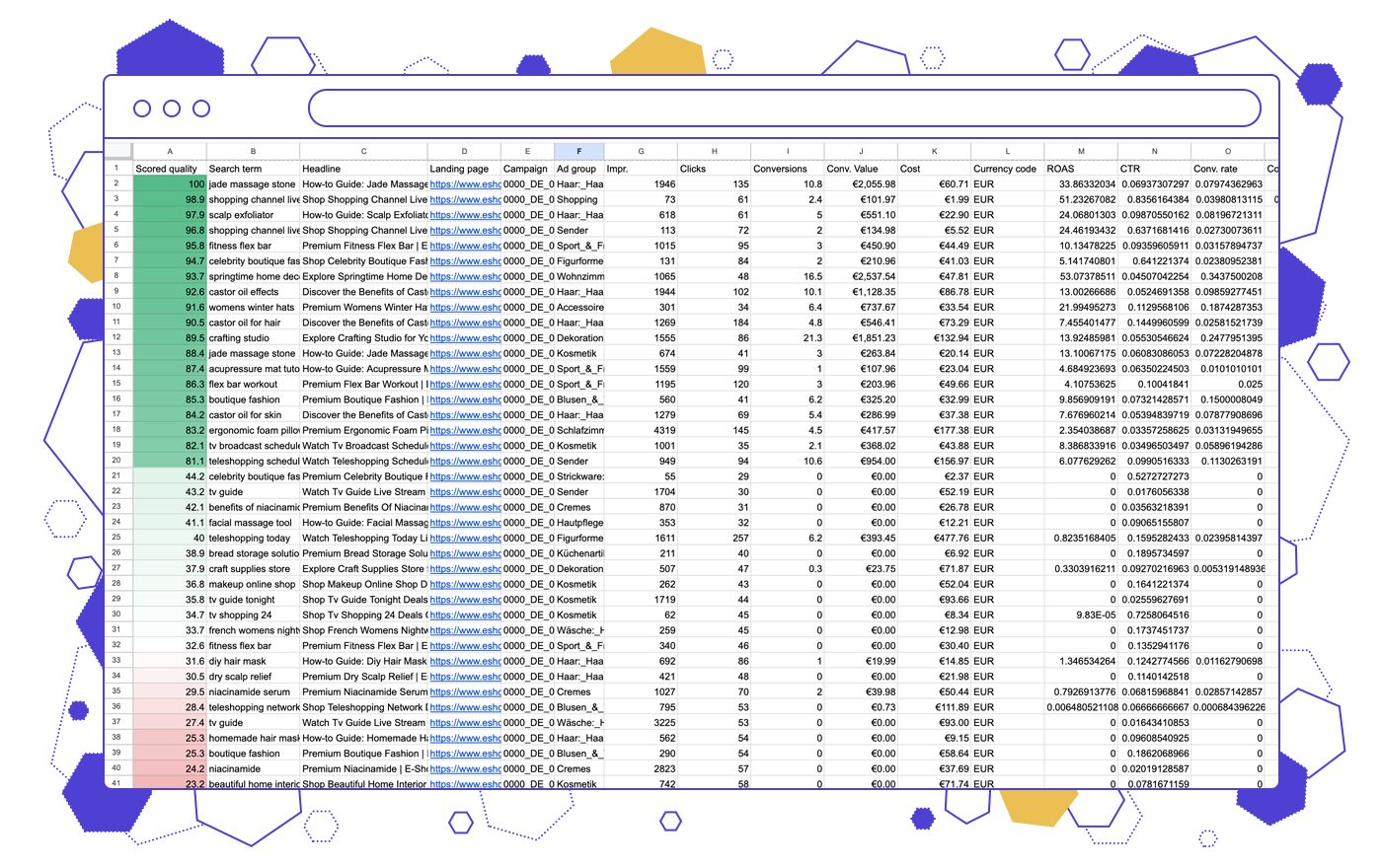
Filtered Heatmap: True performance impact, Sorted
We built this script to turn a massive data dump into a color-mapped triage list. It assigns a dynamic, cost-weighted ROAS score so you can instantly see if Google is matching credible search terms to the right pages.
The magic is in the math. It scores each variation against its own campaign’s average ROAS—not a global baseline. This isolates your proven traffic and grades every row fairly against its peers, leaving you with an effortlessly readable, prioritized action plan.
.png)
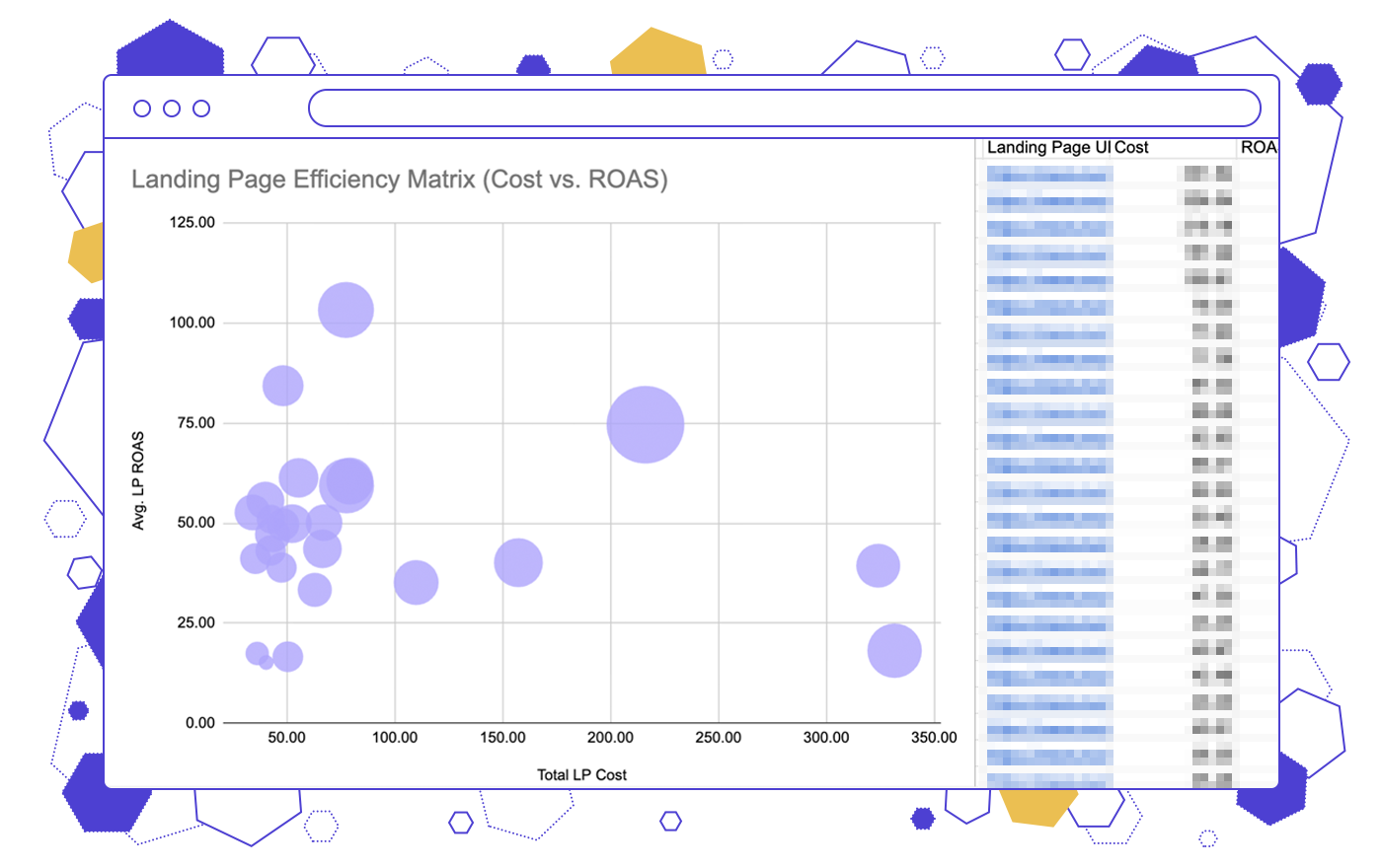
Visual dashboard: High-level patterns revealed
Analyzing isolated rows makes it impossible to see why a variation is failing. Our Dashboard solves this by aggregating your data by landing page, search term, and headline, instantly exposing the high-level patterns causing your budget bleed. This way you get both granular “child” data for each combination and zoomed-out “parent” data.
It turns raw scoring into an intuitive visual dashboard. Between an efficiency matrix and CTR leaderboards that clearly separate your 'Heroes' from your 'Traps', you get a complete tactical view of exactly what to cut and what to push.
![]() Note: We designed this script specifically for heavy enterprise accounts. For smaller accounts, or those just beginning to experiment with AI Max, the script might filter out too much data.
Note: We designed this script specifically for heavy enterprise accounts. For smaller accounts, or those just beginning to experiment with AI Max, the script might filter out too much data.
Get the AI Max Triage script!
Turn your raw AI Max data into a prioritized action list. Leave your email below to unlock the script.
We take your privacy seriously. Read our privacy policy.
Get your script code below:
The code was successfully copied to your Clipboard.
Frequently Asked Questions
The AI Max Triage Script isolates your statistically significant traffic so you know exactly what is working and what is wasting money.
- Review your color-mapped action list to spot the biggest money-wasters.
- Review failing headlines and add rogue search terms as negatives.
- Protect your daily spend and scale your proven combinations.
In your Google Ads account, go to Tools → Bulk actions → Scripts, and create a new script. Delete the placeholder code. Then copy and paste the code from this page, once you register.
Next, look for this line in the code: const SHEET_URL = 'https://...';
Replace the sample URL with an actual empty Google Sheets that you created or copied.
That’s it — run the script, and it will output the dashboard right into the same Sheet.
The standard Google Ads view gives you tens of thousands of rows of raw data, but it only lets you sort by one metric at a time. It leaves your most profitable combinations and your biggest money-wasters hopelessly tangled together. The AI Max Triage Script fixes this by filtering out low-volume noise and scoring every row. Instead of a chaotic data dump, you get a color-mapped heatmap and an executive dashboard that tells you exactly what to cut.