Subscribe to join thousands of other ecommerce experts
Data-informed decision making is a core opportunity – and challenge – for paid search experts in a fast-paced and constantly-changing business environment. Shopping is a highly-competitive channel and many online retail verticals are increasingly saturated, meaning that understanding and acting on your data has never been more important.
The Google Ads interface is limited primarily to simple line charts and large tables, which creates a heavy reporting and analysis workload for PPC managers. The result is that multiple tools are often in use, which increases workflow complexity and adds gaps between analysis and action. This kind of gap or lag is known as data latency. High latency decreases the actionability and business value of your data insights.
So why not ease this pain of having “bits and pieces” in various places?
We are releasing a new core capability of Whoop!, our Google Shopping management solution. This new feature set is called Shopping Insights.
What we offer:
Four powerful data visualisations are now available in Whoop!, enabling users to discover and understand potential for campaign optimization at the target-country level.
- Shopping Performance Treemaps
- Shopping Seasonal Heatmap
- Product Waffle Chart
- Search Term Sunburst
Just by signing into Whoop!, you now have the possibility to visualize and interact with key performance data in addition to your favorite management features. You’ll find everything in one place, which frees up your time to focus on exploring tactical and strategic measures in order to optimise your campaigns and boost your overall performance.
What’s in for you:
- pre-built interactive dashboards that structure and display your data to be more informative
- frictionless in-app access to performance insights at the target-country level
- spot trends, unlock potential, and make data-informed decisions with these visualisations
With our new feature, Shopping Insights, it is now possible to visualise your data directly within Whoop! – There is no extra login required and the data is mapped to the target countries in your Whoop! account. Having country-specific insights is an exceptional advantage given the fact that KPIs and trends can vary substantially between regions.
Table of Contents
How you can access your data in Whoop!
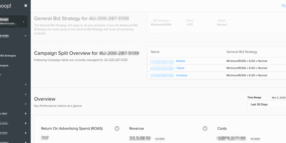
To access these powerful charts, simply click on Shopping Insights in the target country overview, right beneath Advanced Bid Strategies. You will then see the current list of charts you can choose from for a deep-dive into your campaign performance data.

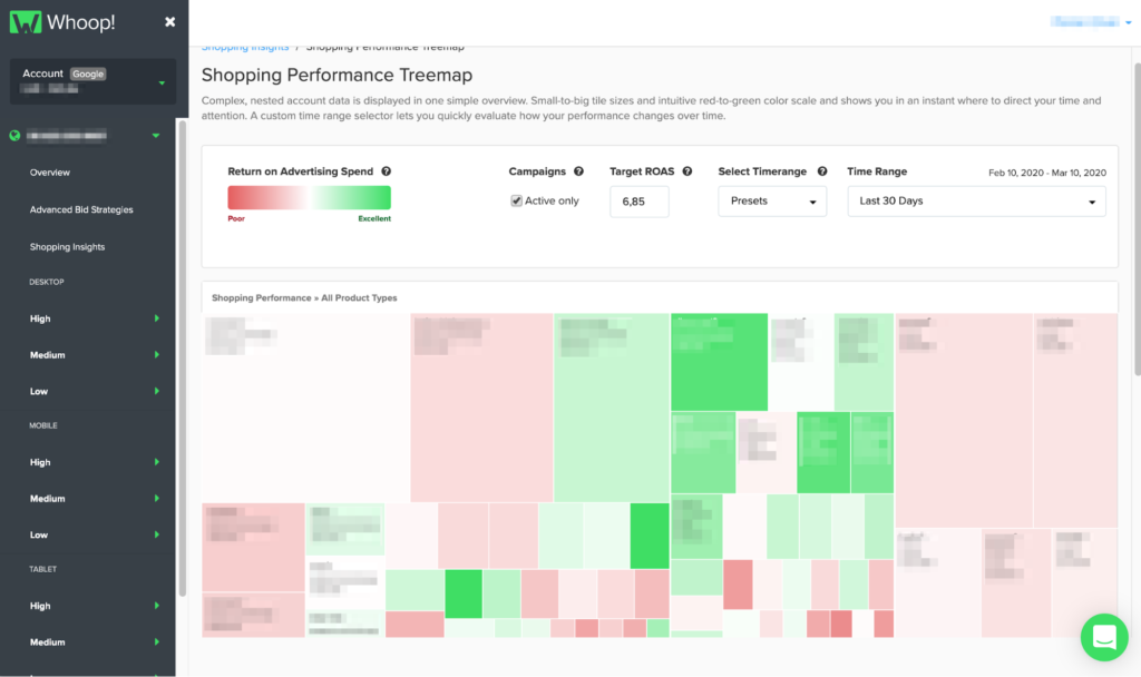
Shopping Performance Treemap
The Shopping Performance Treemap offers you a better understanding of brand and product type performance. The data revealed by this chart type helps you to unpack your account structure and get a clear overview of the performance in a given target country. This visualization is especially useful to quickly spot your top and low performers in a given time range, sized according to the share of costs. This is like a health check, which can influence your goal setting or budget for different segments. Just bear in mind that for recent time periods (within the last 30 days), your conversions might not be fully attributed, so your ROAS might increase with time. It’s also worth mentioning that an average ROAS is presented, and there are cases where it’s natural or even desirable for different product types or brands to perform at different levels. A red rectangle isn’t necessarily an action item – but rather an attention item.
There are two main dimensions to this chart: size and color, which are mapped to cost and ROAS delivery, respectively. For example, a big red rectangle means that the ROAS performance in this product type is poor and the costs are high. In contrast, green rectangles represent a good ROAS and relatively high costs. Pale rectangles perform in a neutral way compared to the specified ROAS – actually, usually a good thing, neither over- nor underdelivering.
At the top of the overview you have controls to select a time range and a ROAS goal (by default, it shows the average ROAS for the time range). You also have a checkbox to display only active campaigns – consider unchecking this when you look farther in the past in order to include old campaigns that might be paused now.
Shopping Seasonal Heatmap
The Shopping Seasonal Heatmap is quite useful for analysing your cost and conversion trends for a given target country across the calendar year. Heatmaps present a data matrix where values are represented by colors to make them comparable – for example, showing conversion density over the year. Seeing your data presented this way can help to estimate demand levels in order to plan monthly budgets or adjust goals and thresholds. You can inspect your seasonal performance according to brand or product type (level 1) and hover your cursor to see specific metrics for any week of the selected year.
Knowing your cost and conversion trends helps you to set your bidding behaviors and goals accordingly in order to save money during low performing seasons or push more aggressively in peak seasons. In the example pictured, you can see that cost distribution varies widely per product type. Questions you might ask:
- How often does each brand or product type peak?
- Is the peak intensely concentrated or more spread out?
- Are my costs peaking with expected demand, or am I spending too soon/too late?
Like the performance treemap above, the heatmap has a time range selector. You can also order your rows by cost, conversions, or conversion value. Finally, you can switch color mapping from “per row” to “global”, which weighs every weekly cell against every other weekly cell, instead of just cells in the same row. This enables you to see the intensity of costs or conversions at the whole account level, so you can see which brands and product types were most active.


Product Waffle Chart
With the Product Waffle Chart you are able to review broad or highly-specific product clusters based on mix-and-match KPI filter combinations. Also known as a square area graph, the waffle chart is (believe it or not) a type of pie chart – but it looks and functions quite differently. This chart is excellent for displaying smaller percentages and it’s also much easier to compare segments.
What you see here is a grid containing 3000 squares, which represent products with impressions by default. Depending on the size of your assortment, each square might represent multiple products (if your account has more than 3000 items with impressions) or each square might represent a fraction of one product (if you have less than 3000). There is one waffle chart per device.
You can also see the conversion value for each product segment. A supplementary waffle chart shows the cost share of this segment, plus the absolute value displayed below. Meanwhile, a KPI index shows average conversion rate, cost-per-click (CPC), cost-per-action (CPA), and return on ad spend (ROAS).
There are numerous filter combinations you can try, but here are a few examples:
- 1-3 conversions – your longtail products, probably generating a high share of conversion value
- high conversions – your top sellers, consider increasing spend & CPC if ROAS is better than account average
- high clicks, low conversions – budget eaters, could highlight negative keyword opportunities or landing page problems
- low impressions, high conversion rate – untapped potential, might require more aggressive bidding or uncapped budget
- high impressions, low clicks – untapped potential, consider title optimization to improve CTR
- and remember to look for differing performance per device

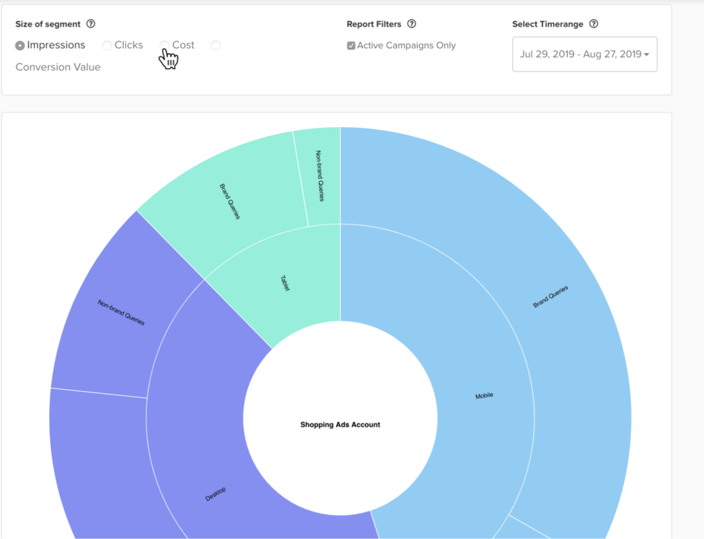
Search Term Sunburst
The Search Term Sunburst helps you to explore the share and performance of different query classes. This is a clickable layered chart, with the layers nested like this:
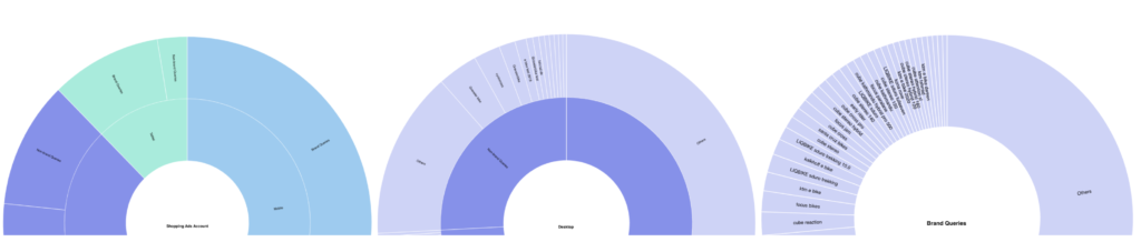
The colors in the chart are not used to indicate performance, but simply to differentiate between devices and chart depth (which layer you are viewing). To view performance, simply hover your cursor over a given segment and it will display a popover with key data, including whether ROAS is up or down compared to the layer above. Drilling down in this manner might reveal, for example, that brand queries outperform the average ROAS in mobile. An overview table is also available below the chart to consolidate the information.
Like the treemap, the waffle chart offers a selectable time range and campaign filter. You can size segments by impressions, clicks, cost, or conversion value. We’ve also built in brand typo detection – typos are particularly frequent on mobile devices – which you can apply with a click.
One of the most powerful features is the ability to segment your queries by generic, brand, or longtail. What does this mean? The sunburst can automatically apply different filter logics to your queries:
- generic = no brand term and no gender, color, or numeric term – e.g. “running shoes”
- brand = presence of a brand term detected – e.g. “nike running shoes”
- longtail = presence of a gender, color, or numeric term detected – e.g. “(men’s) (black) running shoes size (43)”
- you can select which filter or filter combination is relevant for you
Shopping Insights for the future
Our product and data science teams are currently working to prototype and develop additional Shopping Insights pages and aim to cover a variety of topics including brand and category insights, price insights, stock level insights, demand forecasting, and more. We aim to offer a valuable mix of exploratory charts like those above, and more structured “answer-like” information.
Are there areas where additional reporting would be particularly valuable to you? Would you like to participate in user interviews or get beta access to future Shopping Insights? Let us know – we are always glad to hear from you.
source on Google →